
Petsome
Project overview
The problem
Users need to receive easy and quick information on ingredients in pet food.
The goal
Design an app that allows users to create a profile for their pet and getting the information they need in a simple and easy way.
My role
UX designer designing an ingredients preview app from conception to delivery.
Responsibilities
Conducting user research, digital wireframing, low and high-fidelity prototyping, conducting usabilty studies, accounting for accessibility, and iterate on designs.
Understanding the user
User Research
A primary user group identified through research was pet owners and care takers who want to get quick and helpful information about pet food before ordering. Also they need helpful information regarding the health of their pets so they can choose the right food.
User pain points
Mobility
Difficulty to go shopping due to mobility. The app will help with the option of ordering online.
Information
Apps for ordering pet food don't provide enough quick information of the ingredients.
Abundance
There's no easy way to distinguish between a lot of food brands.
Starting the design (using Figma)
Paper wireframes
Taking the time to draft iterations of each screen of the app on paper ensured that the elements that made it to digital wireframes would be well-suited to address user pain points. For the home screen, I prioritized the option to choose between a pet to create a profile or looking at the additional features.
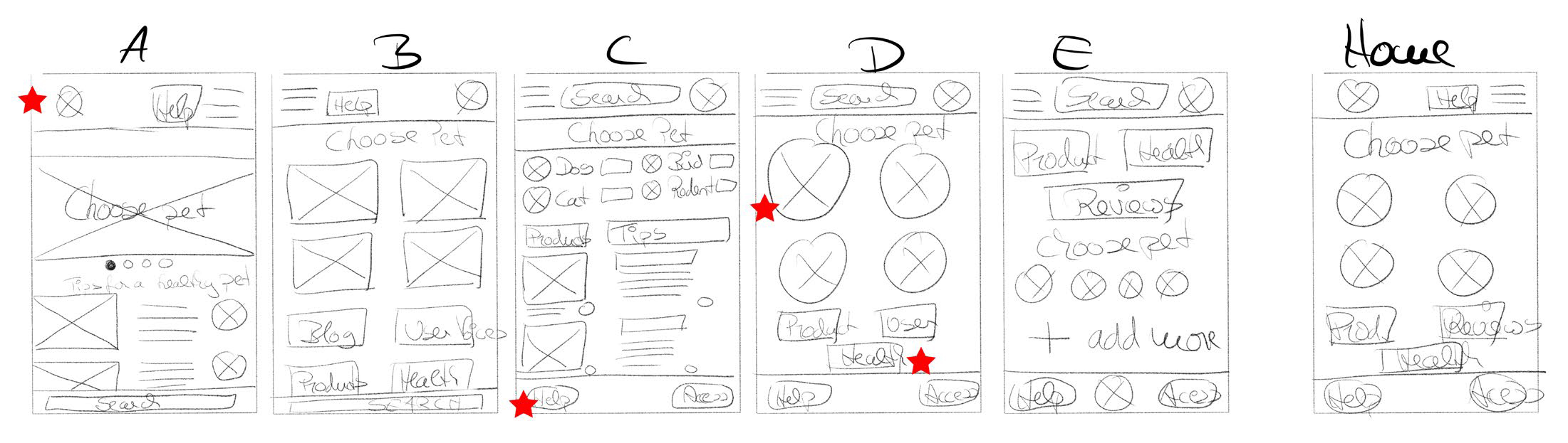
Stars were used to mark the elements of each sketch that would be used in the initial digital wireframes.
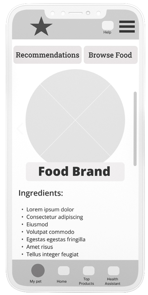
Digital wireframes
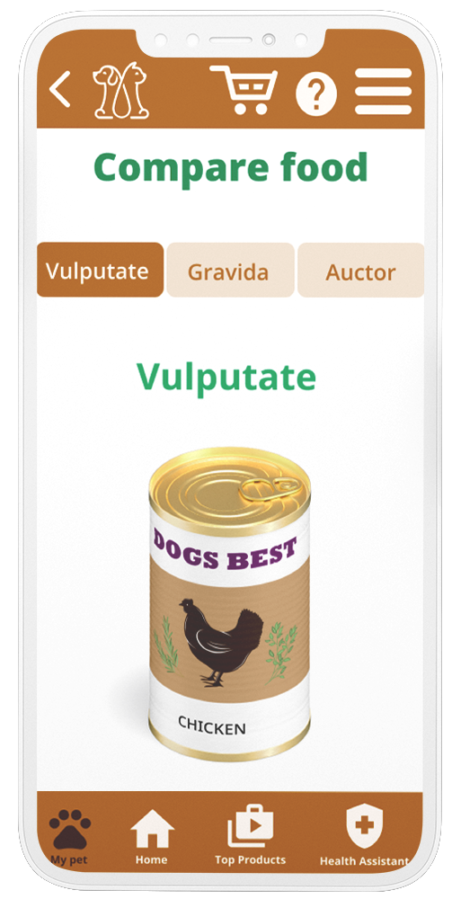
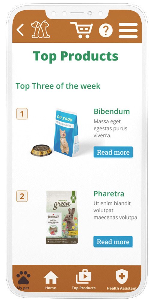
Food
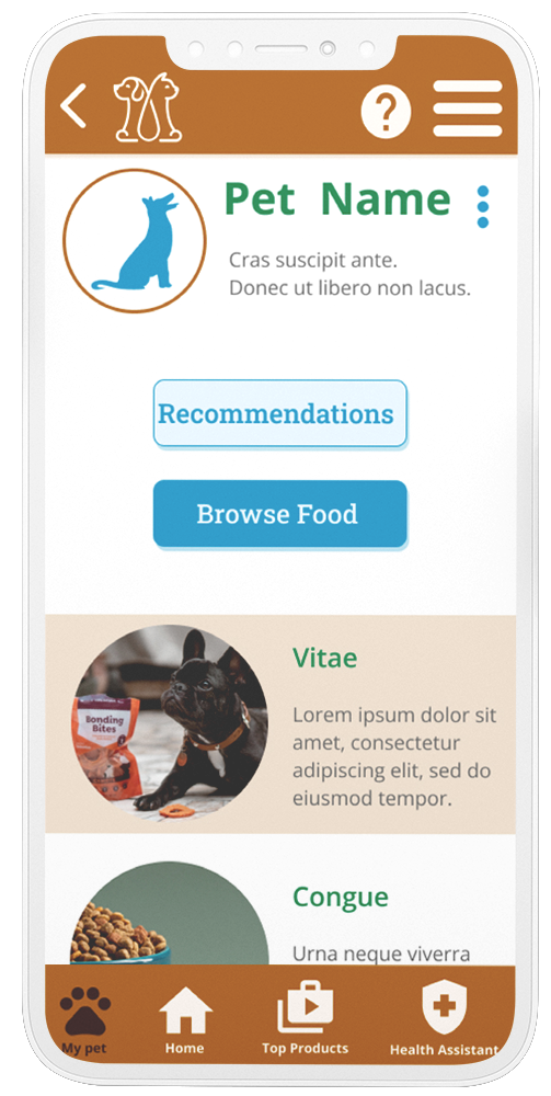
The usabilty studies revealed that some users would prefere a compare food option. I integrated an extra screen and a button to choose “compare the food” or “add to cart”.
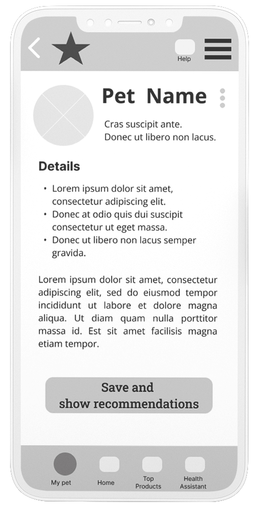
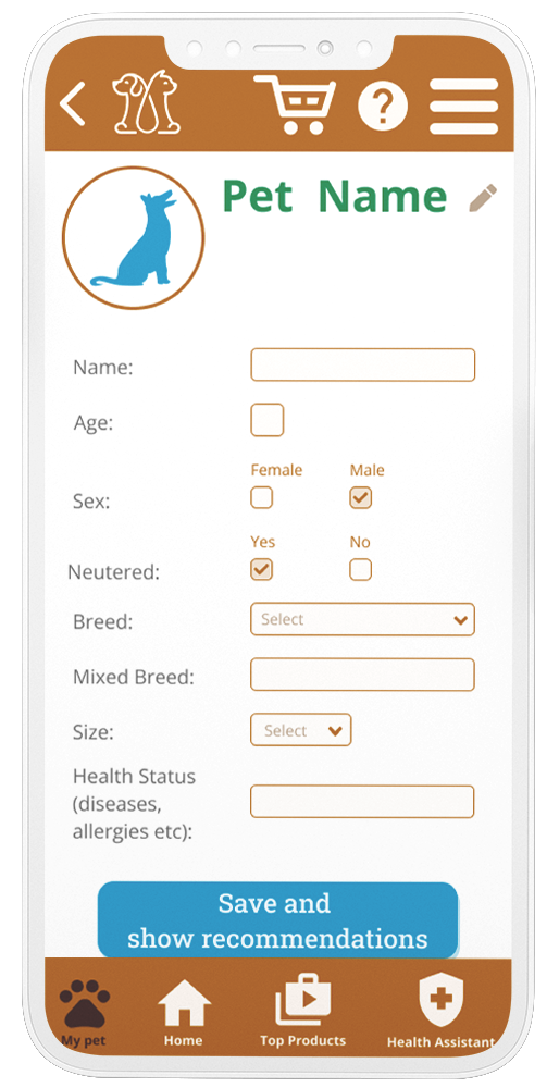
Pet profile
Early designs were confusing as there was no indication in typing those details in and what details should be included. I changed the site so that it is clearly understandable what to do, like the type fields and selection dropdowns.
Final mockups
High-fidelity prototype (feel free to try it out)
Accessibility considerations
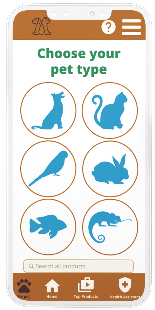
Icons were used to make navigation easier.
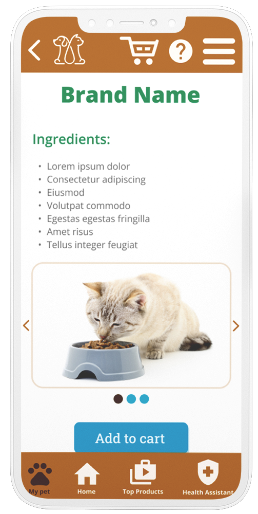
Clear images were for the products were used to help better understand the design.
Colors with contrast were used, and ALT text for images will be used.
Takeaways
Impact
This app helps users get quick information about pet food and also ordering it.
One quote from peer feedback: “I like this app and I think it's a very good idea to have an app like this.”
What I learned
I learned that it takes a lot of effort to create a design that helps all of the users. I think it's interesting how my designs changed through the usability studies which are really helpful.