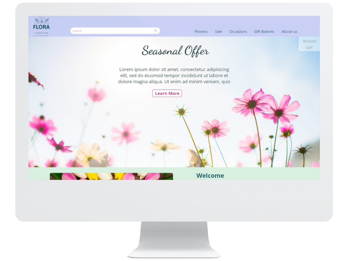
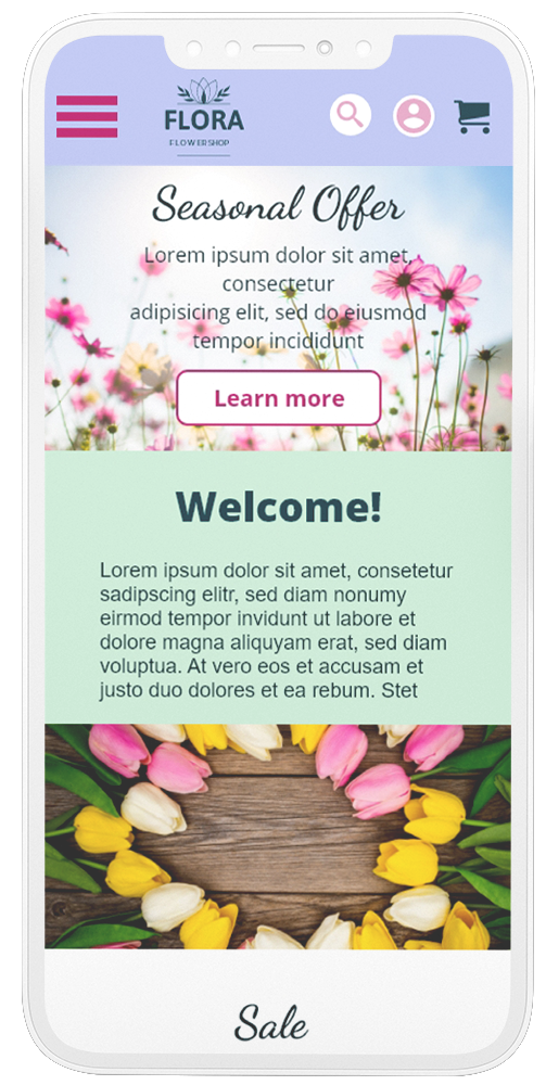
Responsive website for a flower ordering process
Project overview
The problem
Users want to easily order flowers for different occasions.
The goal
Design a responsive website that let the user choose easily from different options to order flowers for their special event.
My role
UX designer designing a responsive website for a flower-ordering process.
Responsibilities
Conducting user research, digital wireframing, low and high-fidelity prototyping, responsive design, conducting usabilty studies, accounting for accessibility, and iterate on designs.
Understanding the user
User Research
A primary user group identified through research was people who need flowers which fit various occasions and can be ordered quick and easy. Another primary user group are people who want to present others with flowers.
User pain points
Mobile option
A mobile version of the website is needed.
Choices
Too many flowers to choose from, there are no good filter options.
Starting the design (using Adobe Xd)
Paper wireframes
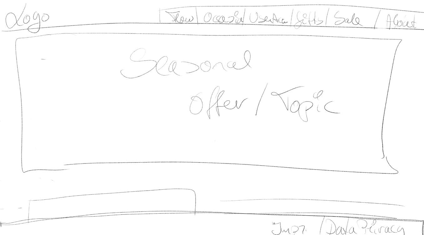
This time I only made one screen as quick scribble and continued already to the digital wireframes as this is more comfortable for me.
Digital wireframes
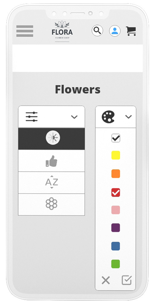
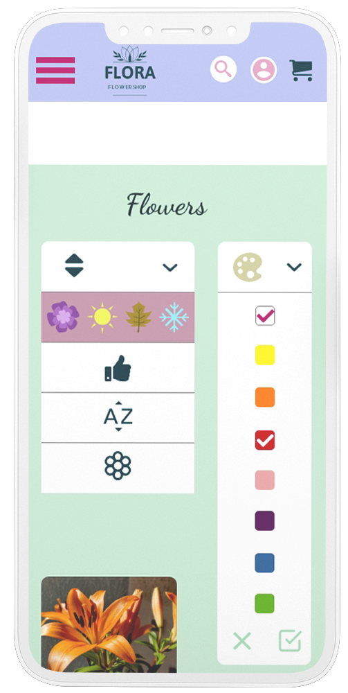
Confusing icons
The usabilty studies revealed that some users aren't sure what the icons in the drop-down menu mean.
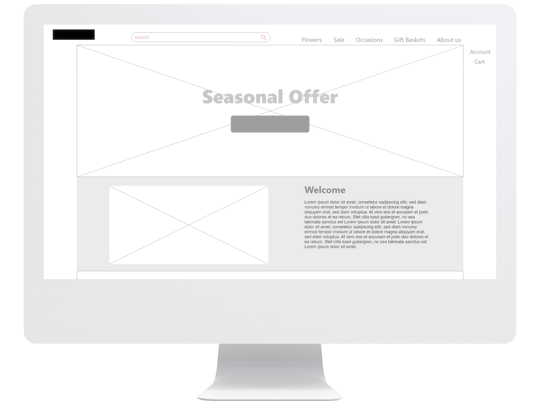
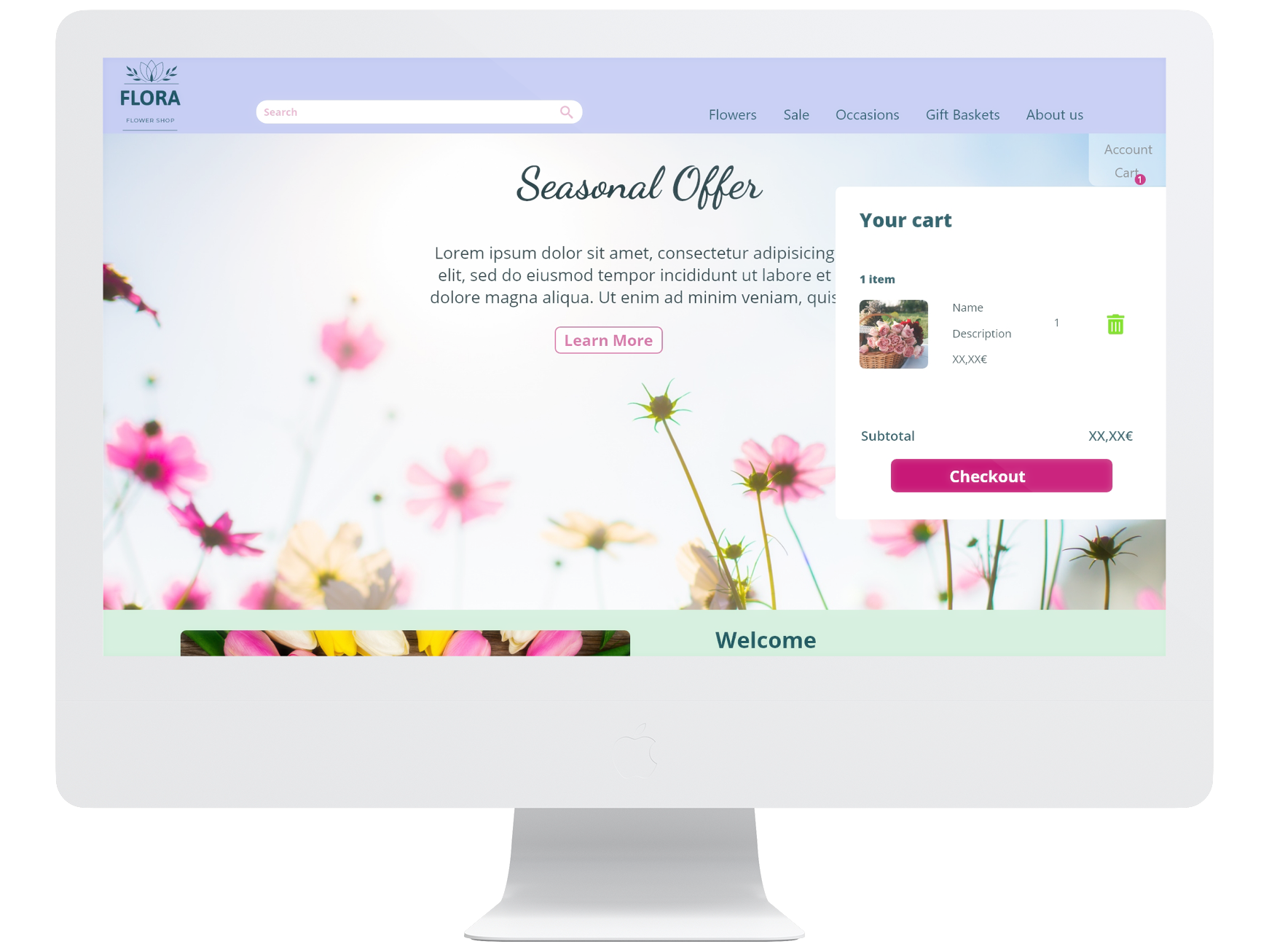
Consistency
Furthermore the usabilty studies revealed that users wanted the design to more consistent.
Final mockups
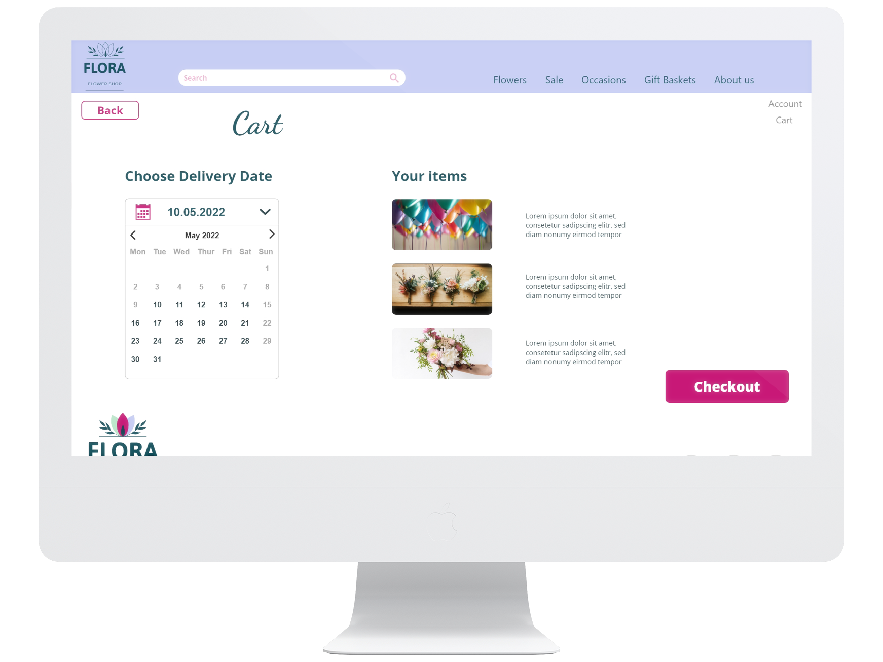
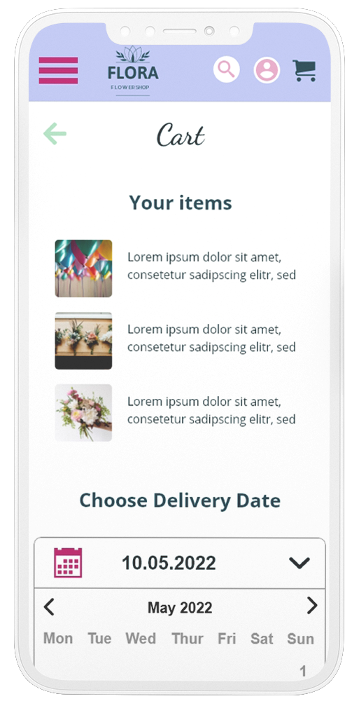
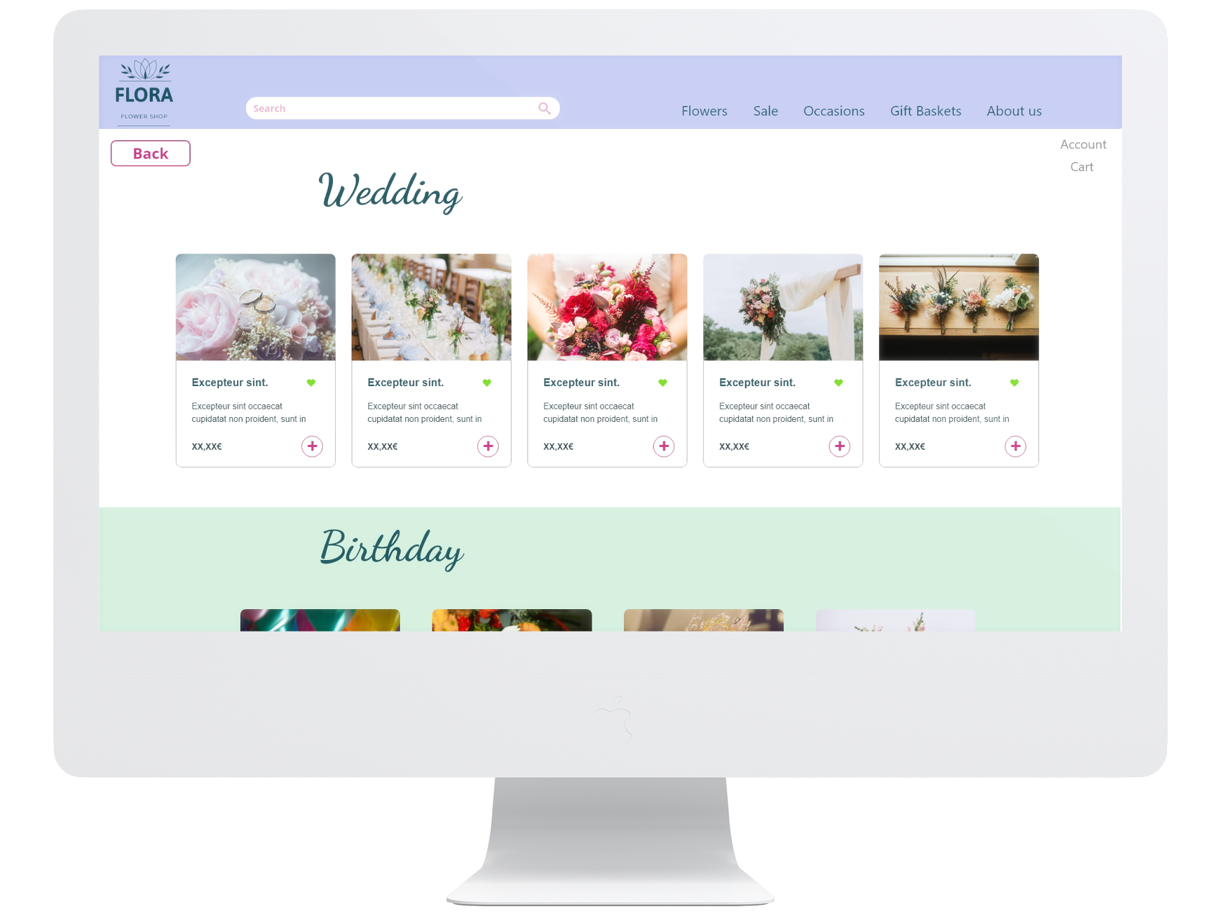
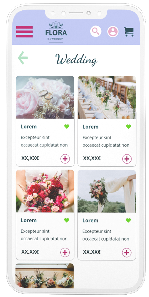
High-fidelity prototype
Accessibility considerations
Icons were used to make mobile navigation easier.
Images for the products were used to help better understand the design.
A screenreader option will be available.

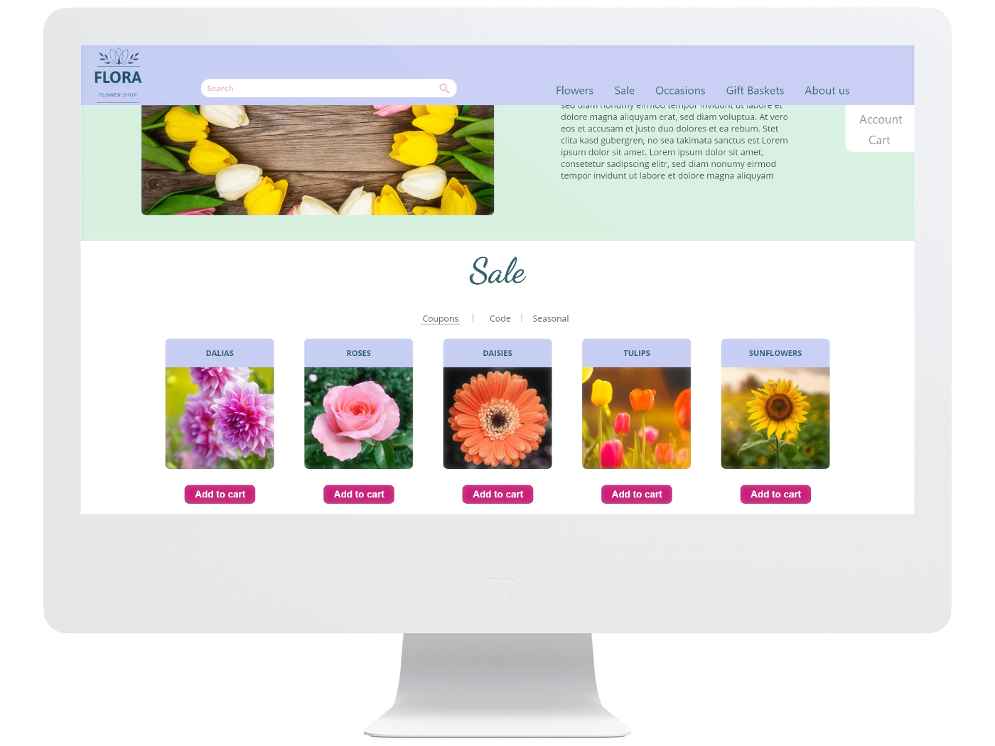
Takeaways
Impact
This website helps users find the right flowers for their needs and order them right away.
What I learned
When working on a responsive website you need to think of the different screen sizes and how to adapt the design that it is still consistent. This was quite difficult sometimes.
